Observations
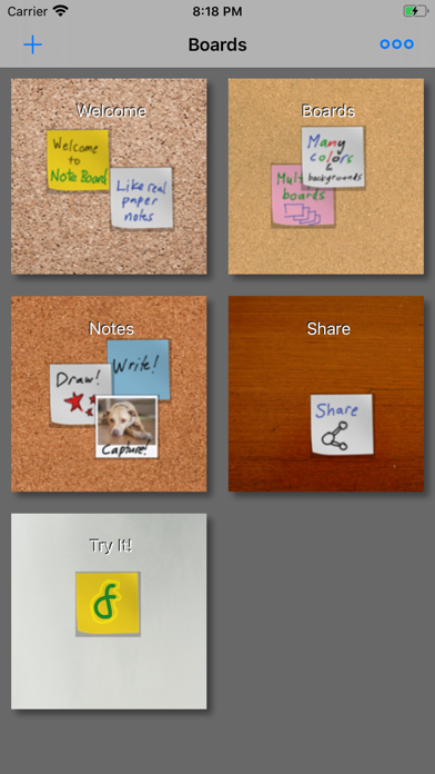
- The icon shows three overlapping sticky notes — yellow in front, green bottom-left, pink/red top-right — with a stylized cursive 'F' glyph (the developer's logo) on the yellow note. At App Store search thumbnail size (~60x60pt), the three-note composition reads well and communicates 'sticky notes app' clearly. The color palette is bright and high-contrast against a light gray background, giving it good shelf visibility.
- The 'F' glyph is the weak point. At thumbnail size it reads as an abstract musical note or flourish, not as a brand letter or a functional cue. Users who don't already know 'Digital Footmark' get no brand signal from it. In the Productivity category, competitors tend to use either strong letterforms (N for Notion, E for Evernote) or clear object icons (a pen, a checkmark). The cursive F adds noise without adding meaning.
- The sticky-note stack composition is category-appropriate and immediately recognizable, which is the icon's main job. No redesign is warranted — this is a refinement conversation, not a rebuild.
Recommendations
- Keep the three-note stack composition as-is — it communicates the app's core concept at a glance and is the icon's primary strength.
- Consider replacing the cursive 'F' glyph with either a small pen/pencil stroke, a camera shutter symbol, or removing the glyph entirely to let the clean sticky-note stack speak for itself. A glyph is only worth keeping if it adds meaning; the 'F' currently subtracts it.
- Hold the current icon through your first major download push. Once you have enough traffic data, run an Apple Product Page Optimization A/B test comparing the current icon against a glyph-free version.