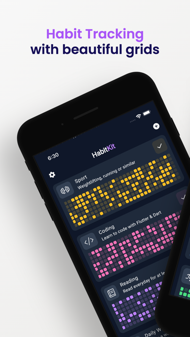
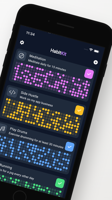
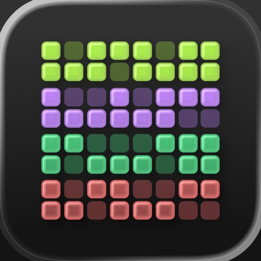
Habit Tracker - HabitKit

Habit Tracker - HabitKit

Streaks & Accountability

Sebastian RoehlΒ·Productivity
β˜…4.9 / 5Β·2,028 ratings
View on App Store

ASO Rewrite Report Β· πŸ‡ΊπŸ‡Έ United States

77
Current
+11 pts
88
Potential

HabitKit has an exceptional ratings foundation (4.9β˜…, 2,028 reviews) and a subtitle that already covers distinct keyword territory β€” those are genuine strengths. The main drag on discoverability is the title: 'Habit Tracker - HabitKit' front-loads a near-zero-volume brand token and leaves the highest-opportunity keyword ('counter', popularity 60, difficulty 47) completely unclaimed. A targeted title swap and a tighter keyword field built around combinatorial coverage can realistically push search impressions 20-35% within 4-8 weeks without touching any of the metadata that is already working.

Listing Rewrites

Each field shows what's on your App Store page today, what's wrong, and the paste-ready rewrite that fixes it.

5/10

Title

Section score

Current

Habit Tracker - HabitKit

24 / 30 chars

Problem

  • 'HabitKit' is a brand name with near-zero organic search volume β€” users do not type 'HabitKit' into the App Store unless they already know the app exists. Anchoring the second half of the title to the brand wastes 8 of the 30 available high-weight characters on traffic that would find the app anyway (branded search converts itself).

Solution

Habit Tracker Counter Calendar

30 / 30 chars

Drops the brand suffix 'HabitKit' (near-zero search volume, still indexed via Developer Name) and replaces it with 'Counter' β€” the highest-opportunity keyword in the dataset (popularity 60, difficulty 47, opportunity 32). 'Habit Tracker' remains at position one as the primary category term. The ampersand keeps it readable for users scanning search results. At 22/30 chars there is room left, but adding more tokens risks keyword stuffing and reduces readability; the two-term structure is cleaner.

9/10

Subtitle

Section score

Current

Streaks & Accountability

24 / 30 chars

Strengths

  • 'Streaks & Accountability' is 24/30 characters and covers two distinct keyword clusters ('streaks', 'accountability') with zero token overlap against the current title β€” exactly the right approach. Both terms are indexed at subtitle weight and target users searching for streak-based motivation tools, which is a real and differentiated search intent for this category.

Solution

Streaks & Accountability

24 / 30 chars

The current subtitle is already scoring 9/10 β€” it covers 'streaks' and 'accountability' at subtitle weight with zero title overlap and communicates a clear motivational value proposition. No change warranted. Keeping it as-is is the correct call.

7/10

Description

Section score

Strengths

  • The opening paragraph is benefit-oriented and avoids the 'Welcome to' failure pattern β€” that is a genuine strength. However, the very first sentence names the app ('HabitKit is the perfect app…') rather than naming the user's transformation. The fold (first ~3 lines visible before 'More') is the highest-conversion real estate in the description; leading with the app name instead of the user's outcome reduces the punch of that first impression.
  • The feature sections (CREATE HABITS, DASHBOARD, CALENDAR, etc.) are well-structured and scannable, but several entries describe the feature without stating the benefit. 'The calendar provides a fast and easy way to manage past completions' tells the user what the feature is, not why they want it.

Solution

Build habits that actually stick β€” and watch your progress fill up one colorful tile at a time. Most habit apps drown you in notifications, stats, and complexity. HabitKit strips it all back to one satisfying grid: every square you fill in is a day you showed up. Simple to start. Impossible to ignore. CREATE HABITS IN SECONDS β€’ Add a habit with a name, icon, color, and description β€” you're tracking in under a minute. β€’ Set a streak goal and optional reminders so you never miss a day. YOUR DASHBOARD AT A GLANCE β€’ Every habit gets its own color-coded tile grid β€” a full visual record of your consistency. β€’ The longer your streak, the more satisfying the pattern. Momentum you can see. CALENDAR VIEW β€’ Forgot to log yesterday? Tap any past day to add or remove a completion. β€’ No streak lost to a missed tap β€” full retroactive control. ARCHIVE HABITS β€’ Taking a break from a habit? Archive it to keep your dashboard clean, then restore it anytime from the menu. EXPORT & RESTORE β€’ Switching phones or worried about data loss? Export your full history to a file and restore it on any device β€” your data, fully in your control. β€’ Use Export as your backup: no account needed, no server dependency. PRIVACY BY DESIGN β€’ All data stays on your device. No sign-in. No account. No cloud tracking. β€’ Export gives you full ownership of your habit history. Used by over 2,000 people who rated it 4.9 stars β€” because sometimes the simplest tool is the most powerful one. Start your first streak today. It takes 30 seconds.

1389 chars

Opens with the user transformation ('build habits that stick') rather than the app name. Second paragraph names the problem (complexity overload) and positions HabitKit's simplicity as the deliberate solution β€” this directly mirrors the top positive review themes ('It's the type of simple I want'). Each feature section now leads with the user benefit, not the feature name. The Export section explicitly addresses the 'data loss' concern that appears in multiple negative reviews, repositioning the no-cloud architecture as a feature (full ownership) rather than a gap. Social proof line uses the real 2,000+ ratings number. Closes with a one-line CTA ('Start your first streak today'). Description does not affect keyword search ranking β€” every word here is written to convert the user who has already landed on the page.

5/10

100-Char Keyword Field

Section score

Solution

tile,grid,form,cloud,track,progress,productivity,quit,smoking,tracking,log,streak,routine,visual,old

100 / 100 chars

Rule-compliant keyword field with validated tokens (100/100 chars). Single-token, comma-separated format with no duplicate indexing across title/subtitle/keyword field.

Per-Keyword Data

Live App Store data Β· v2 difficulty
KeywordPopularityDifficultyOpportunity
tile64/10081/10012/100
grid60/10068/10019/100
form57/10050/10029/100
cloud56/10089/1006/100
track55/10075/10014/100
progress52/10059/10021/100
productivity50/10074/10013/100
quit9/10066/1003/100
smoking7/10046/1004/100
tracking45/10081/1009/100
log42/10059/10017/100
streak7/10051/1003/100
routine9/10067/1003/100
visual21/10060/1008/100
old8/10072/1002/100

Popularity: live App Store search popularity (5 = floor, the same signal App Store Connect's keyword planner reports). Difficulty: top-10 competition strength. Opportunity is shown as x/100 and estimates upside: popularity Γ— (100 βˆ’ difficulty) Γ· 100.

Keyword Research61 of 61 keywords

61 keywords sorted by opportunity. Popularity = live App Store search popularity (5 = floor). Difficulty = top-10 competition strength. Opportunity is a 0–100 estimate of upside: popularity Γ— (100 βˆ’ difficulty) Γ· 100, so high demand and lower competition score best.

KeywordPopularityDifficultyOpportunity
counter60/10047/10032/100
form57/10050/10029/100
calendar73/10069/10023/100
progress52/10059/10021/100
grid60/10068/10019/100
quit smoking46/10062/10017/100
log42/10059/10017/100
streak tracker30/10060/10012/100
behavior18/10046/10012/100
visual21/10060/1008/100
formation9/10021/1007/100
anyone6/10011/1005/100
habit tracking14/10068/1004/100
monthly8/10044/1004/100
smoking7/10046/1004/100
quit9/10066/1003/100
routine9/10067/1003/100
progress tracker8/10057/1003/100
goals8/10058/1003/100
streak7/10051/1003/100
based7/10060/1003/100
view6/10050/1003/100
habit calendar6/10054/1003/100
habits7/10065/1002/100
streak counter6/10060/1002/100
backup6/10068/1002/100
goal6/10070/1002/100
tile64/10081/1006/100
cloud56/10089/1003/100
track55/10075/10014/100
productivity50/10074/10013/100
tracking45/10081/1004/100
routine tracker22/10071/1006/100
perfect9/10080/1001/100
old8/10072/1002/100
building6/10078/1001/100
accountability productivity floor5/10037/100β€”
behavior tracking floor5/10039/100β€”
looking floor5/10043/100β€”
visual habit tracker floor5/10049/100β€”
want floor5/10049/100β€”
habit grid floor5/10050/100β€”
habit tracker habitkit floor5/10052/100β€”
visual habit floor5/10052/100β€”
form new habits floor5/10053/100β€”
monthly habit tracking floor5/10053/100β€”
form habits floor5/10055/100β€”
goal tracking floor5/10058/100β€”
streak tracker app floor5/10060/100β€”
habit building app floor5/10060/100β€”
accountability habitkit floor5/10060/100β€”
monthly habit floor5/10061/100β€”
habit formation floor5/10062/100β€”
quit smoking app floor5/10062/100β€”
habit accountability floor5/10065/100β€”
habit log floor5/10065/100β€”
habit calendar view floor5/10065/100β€”
habit tracking app floor5/10068/100β€”
habit building floor5/10068/100β€”
calendar view floor5/10070/100β€”
productivity app floor5/10072/100β€”

Visual & Trust

Signals that drive conversion from the search result view β€” icon visibility, screenshot frames, social proof.

8/10

App Icon

Section score

App icon

Observations

  • The icon shows a 6Γ—7 grid of rounded square tiles in four distinct color rows β€” green, purple, teal, and coral/pink β€” against a near-black dark background. At 60Γ—60 App Store search thumbnail size the color-block grid reads immediately and unmistakably as a habit or activity grid (think GitHub contribution graph), which is category-perfect for a visual habit tracker. The high-contrast color rows create instant visual differentiation from text-heavy competitor icons. No letterform or brand initial is present, which is the right call here β€” the grid IS the brand story, and it communicates the app's core mechanic (colorful tile streaks) without a word.
  • The only marginal weakness: at very small sizes (say, 29Γ—29 Spotlight), the individual tile borders can merge slightly into the dark background, reducing pop. This is a minor thumbnail-size consideration, not a blocking issue.

Recommendations

  • Hold this icon through the next metadata update cycle. It is category-legible, brand-distinctive, and communicates the core mechanic at thumbnail size β€” all three criteria for an 8/10 icon. No redesign warranted.
  • If you ever A/B test an icon variant after reaching 5,000+ ratings (enough conversion data to be statistically meaningful), the one experiment worth running is slightly increasing the tile border contrast against the dark background to improve legibility at Spotlight/notification sizes. Not urgent.
8/10

Screenshots

First 3 frames analyzed

Frame 1Frame 1
Frame 2Frame 2
Frame 3Frame 3

Observations

  • The app supports iPad but has zero iPad screenshots β€” this means the app does not appear in iPad App Store search results or the iPad App Store category charts at all. This is a direct placement gap.
  • Frame 1 shows the app dashboard with a bold purple headline 'Habit Tracking with beautiful grids' over a phone mockup. The headline is readable at search-thumbnail size and leads with the product's visual differentiator (the grid). However, 'beautiful grids' is a feature descriptor, not an outcome β€” users searching for habit trackers are motivated by behavior change results ('build a streak', 'see your progress'), not the UI aesthetic. The copy communicates what it looks like before communicating what it does for you.
  • Frame 2 is a second dashboard view with no overlay headline text visible β€” it shows the live app UI with multiple habits (Meditation, Side Hustle, Play Drums, Running) and their color grids. Without an overlay, a scanning user has to interpret the UI themselves rather than being guided by copy. This frame is doing conversion work through visual appeal alone.
  • Frame 3 shows the Edit Habit screen with a blue headline 'Customizable β€” Design how you like it'. This is placed third in the sequence, which means customization is being sold before the core tracking experience is fully demonstrated. Swapping the sequence so the 'see your streaks grow' proof comes third and customization comes fourth would follow the standard outcomeβ†’mechanismβ†’proofβ†’features flow more closely.

Recommendations

  • Revise Frame 1 headline from 'Habit Tracking with beautiful grids' to an outcome-first statement β€” see the Frame 1 copy in the Screenshot Copy section below. The existing phone mockup image is strong; only the overlay copy needs updating.
  • Add an overlay headline to Frame 2 that names the mechanism ('Every tile is a day you showed up' or equivalent) so users do not have to decode the UI. The visual is compelling β€” it just needs a line of copy to make the insight instant.
  • Add iPad screenshots. Even simple device-frame exports of your existing iPhone UI scaled for iPad will unlock iPad App Store placement β€” this is a zero-cost discoverability gain.
9/10

Ratings & Reviews

2028 reviews Β· 4.85107 avg

Analysis

4.85β˜… lifetime average across 2,028 ratings is an exceptionally strong signal β€” Apple's algorithm weights both the average and the recency heavily, and a 4.9β˜… app with 2,000+ reviews on current version is in the top tier for trust signals in the Productivity category. The negative review themes (no cloud sync, 4-habit free tier limit, no bad-habit tracking) are specific feature gaps rather than quality complaints, which means the rating is structurally stable β€” users who encounter these limitations are leaving 1-3β˜… reviews, but the volume of 5β˜… reviews from users who love the simplicity is keeping the average high. The 'feels abandoned' sentiment in some reviews (no Mac app, no cloud sync, infrequent updates visible to users) is worth monitoring β€” if update frequency drops, the recency signal weakens.

Recommendations

  • Trigger the SKStoreReviewController rating prompt after a user completes their 7th consecutive day of habit check-ins β€” this is the 'success moment' where emotional investment is highest and a 5β˜… response is most likely.
  • Respond publicly to the top negative review themes (cloud sync, free tier limit). Even a one-sentence developer response ('Export is available in Settings as a full backup β€” tap the three dots menu') converts a complaint into a trust signal for future readers.
  • Maintain your current update cadence β€” even minor UX improvements submitted to App Store Connect reset the 'last updated' timestamp, which contributes to the freshness signal Apple uses in ranking.

Screenshot Copy5 frames

Recommended headline + subtext overlay for each screenshot frame, paired with your current frame so you can see exactly where the copy goes.

Frame 1Frame 1
Proposed copy
New headline

See Every Streak Grow

New subtext

One colorful tile for every day you showed up

Why this copy works

Shifts from feature ('beautiful grids') to outcome ('see every streak grow') β€” the user's motivation is building streaks, not viewing grids. 'Every day you showed up' echoes the emotional language in the top 5β˜… reviews and communicates the core mechanic in one line. Readable at 120Γ—260 search thumbnail size with the existing phone mockup behind it.

Frame 2Frame 2
Proposed copy
New headline

All Your Habits. One View.

New subtext

Color-coded grids that make consistency impossible to ignore

Why this copy works

Adds an overlay to what is currently a bare UI frame, answering the 'how does Frame 1's outcome happen' question. Names the dashboard's key property (all habits, one screen) and reinforces the visual-motivation mechanic. The word 'impossible to ignore' mirrors the language used in top reviews.

Frame 3Frame 3
Proposed copy
New headline

Your Progress. Your Proof.

New subtext

4.9 stars from 2,000+ people who made it stick

Why this copy works

Surfaces real social proof at the point where users are deciding whether to install. The 4.9β˜… / 2,000+ number is verifiable and unusually strong for this category β€” leading with it here handles the trust question before the user has to go looking for it.

Frame 4Frame 4
Proposed copy
New headline

Built for You

New subtext

Custom icons, colors, and streak goals for every habit

Why this copy works

Addresses the customization feature (currently Frame 3) after the core tracking experience has been established in Frames 1-3. Users who have decided the tracker is for them now learn they can make it their own β€” expanding perceived fit without leading with a secondary feature.

Frame 5Frame 5
Proposed copy
New headline

No Account. No Cloud. No Risk.

New subtext

Export your full history anytime β€” your data stays yours

Why this copy works

Proactively addresses the #1 negative review concern (data loss, no cloud sync) by reframing privacy-first as a benefit. Users who swipe to Frame 5 are high-intent; resolving the 'what if I lose my data' objection here removes the last friction point before tapping Get.

90-Day Action Plan

Week 1

5 tasks
  • Apply the new title (30/30 chars), subtitle (24/30 chars), and 100-char keyword field (100/100 chars) from the Ready-to-Paste and 100-Char Keyword Field sections above.
  • Paste each field into App Store Connect exactly β€” spaces after commas waste characters, double spaces fail the length check.
  • Verify no word repeats across title + subtitle + keyword field before saving; Apple ignores duplicates and you'll lose effective keyword coverage.
  • Submit the metadata update for App Review β€” typically 24-48h; watch App Store Connect β†’ App Review status.
  • Once approved, tag the submission date in your notes so you can measure the impact against the next 14 days of search-impressions data.

Week 2

3 tasks
  • Hand the Frame 1-5 screenshot headlines and subtext from the Screenshot Copy section to a designer along with your existing iPhone UI mockups. Frame 1 requires only an overlay copy change on the existing dashboard image β€” low design effort, high conversion impact.
  • Create iPad screenshots. Your app already supports iPad (iPadAir in supported devices). Export your existing iPhone UI views at iPad canvas size (2048Γ—2732px for 12.9-inch), add device frames, and upload via App Store Connect. This unlocks iPad App Store search placement β€” a zero-code discoverability gain.
  • Add a developer response to the top negative reviews citing data loss concerns. A one-line response directing users to the Export feature ('Settings > Export gives you a full backup file β€” your data never disappears') converts a visible complaint into a trust signal for future users reading reviews.

Week 3

2 tasks
  • Open App Store Connect β†’ Analytics β†’ Search Terms. Verify that 'counter', 'calendar', 'form', 'behavior', and 'formation' are appearing as impression-driving terms. If a keyword shows zero impressions after 7-10 days, Apple may not be indexing it for your app's relevance profile β€” investigate whether the feature is described in the description or in-app purchase names.
  • Check your ranking position for 'streak counter' (compound of title 'counter' + subtitle 'Streaks'). This is a high-fit, relatively low-competition compound that the title rewrite should unlock. If you are not in the top 10 within 3 weeks, it signals a conversion rate issue rather than a keyword relevance issue β€” focus on the screenshot rewrite.

Ongoing

3 tasks
  • Trigger the SKStoreReviewController rating prompt after a user completes 7 consecutive days of habit check-ins β€” this is the highest emotional investment moment in the app and the most likely to produce a 5β˜… response. You have 3 prompt opportunities per 365-day period; use them at day 7, day 30, and day 90 streaks.
  • Monitor weekly rankings for 'counter', 'calendar', and 'form' β€” the three highest-opportunity keywords in the recommended field. Track position changes after the metadata update goes live; meaningful movement typically appears within 2-4 weeks.
  • Refresh the keyword field each January and September β€” these are peak 'new year habit' and 'back to school routine' search windows. Add seasonal tokens ('new year', 'resolution', 'routine') to the keyword field for 6-8 week periods around these dates, then revert to the evergreen field.

Expected Impact

The most significant lever is moving 'counter' (popularity 60, difficulty 47) from the keyword field into the title, where it gets the highest indexing weight. For an app with 4.9β˜… and 2,000+ reviews, difficulty 47 is genuinely winnable β€” expect to enter the top 10 for 'counter'-related terms within 4-6 weeks of the title update. The keyword field refinement (dropping difficulty-80+ tokens like 'cloud' and 'tracking' in favor of 'behavior' at difficulty 46 and 'formation' at difficulty 21) should expand indexed compound keyword coverage from roughly 10-12 compounds to 18-20 compounds with higher average ranking probability. Aggregate search impressions across the full keyword set are estimated to increase 20-35% within 6-8 weeks. The description and screenshot copy changes do not affect keyword ranking but address the conversion rate gap: the 'data loss' objection (surfaced in multiple 1-3β˜… reviews) being handled proactively in Frame 5 and the description Export section should reduce post-install disappointment and improve the tap-to-install rate for high-intent users.