Problem
- There is no social proof, no user count, no press mention, and no trust signal of any kind. The app has 4,638 reviews at 4.8 stars — this is extraordinary social proof that goes entirely unused in the description.
Track every expense in seconds — no ads, no subscription, no paywall. Ever.
Expenses OK is the straightforward expense tracker that just works. Open the app, tap a category, enter an amount. Done. No account required, no banner ads interrupting you, no $9.99/month surprise.
Over 4,600 people rate it 4.8 stars — because sometimes the best tool is the one that stays out of your way.
WHAT YOU GET
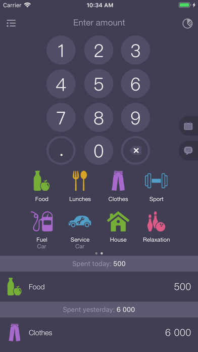
• Instant entry — numeric keypad plus category icons, log an expense in under 5 seconds
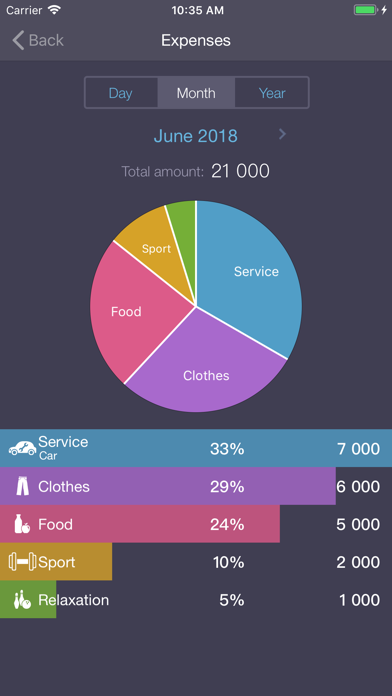
• Pie chart breakdown — see which category is eating your budget at a glance (Food, Clothes, Transport, and more)
• Subcategories — drill down inside any category for detail without clutter
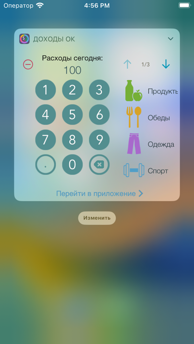
• Home screen widget — check today's spending without opening the app
• Day / Month / Year view — zoom in or out on any time period instantly
• Export to CSV — pull your full expense history into any spreadsheet, no lock-in
• Backups and sync — your data stays safe and travels with you
• Face ID and Touch ID — keep your spending private with biometric lock
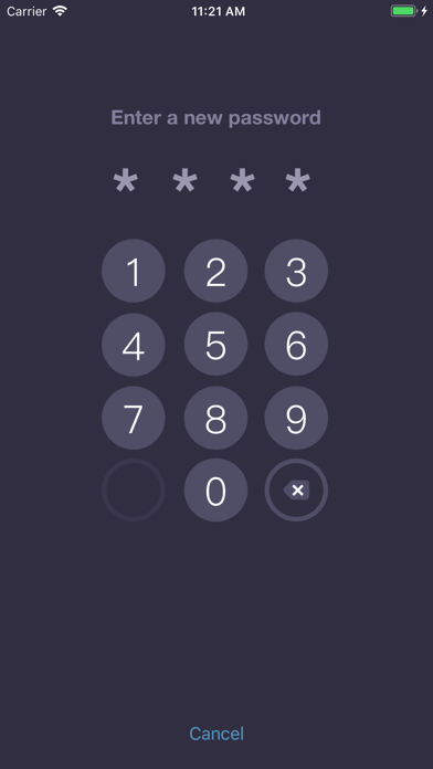
• Password protection — an extra layer if you share your phone
• Works offline — no internet connection needed, ever
No account. No cloud requirement. No ads. Just your expenses, organized.
Download free and log your first expense in under a minute.
1147 chars
Opens with the core transformation and the no-ads differentiator in the first line — visible before the fold. Second paragraph names the pain (complicated apps with paywalls) and positions the solution. Social proof (4,600 ratings, 4.8 stars) appears in the first visible section. Feature bullets translate each capability into a user benefit rather than a spec label. 'Works offline' is explicitly named since 'offline' is the highest-opportunity keyword in the dataset (popularity 64) and a genuine feature. Closing CTA is short and action-oriented. Total length is ~1,147 characters — substantive enough to convert but not padded.