Observations
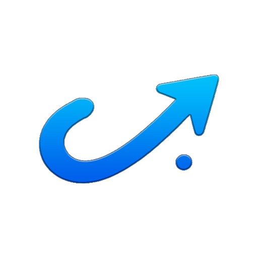
- The icon shows a bold blue curved arrow pointing upward on a clean white background — a strong, legible composition. At 60x60 App Store search thumbnail size the arrow reads instantly as 'upward momentum / progress,' which maps well to a habit and accountability app. The blue gradient is vibrant and category-appropriate. The small dot at the base of the arrow adds a subtle design detail that is visible at full size but disappears at thumbnail — not a problem, just neutral. The white background means the icon loses definition when placed against App Store's white search results list, creating a slight floating effect rather than a contained icon shape.
- No letterform or app-name glyph is present — the icon relies entirely on the arrow metaphor to communicate the app's function. In the Health & Fitness category, where many competitors use human figures, hearts, or flame glyphs, the abstract arrow is differentiated but does not immediately signal 'habit tracker' or 'AI coach' to a cold user scanning results.
Recommendations
- Consider adding a subtle dark or colored border radius / background fill to contain the icon shape against App Store's white background — even a very light grey or soft blue wash behind the arrow would prevent the 'floating' effect and make the icon read as a discrete tile in search results.
- The core arrow concept is strong — do not redesign it. If you want to reinforce the 'habit / check-in' function, a micro-treatment (a small checkmark integrated into the arrow tail, or a subtle circular loop suggesting a daily cycle) could strengthen category fit without sacrificing the clean composition. Test only after you have enough install data to run an A/B experiment.