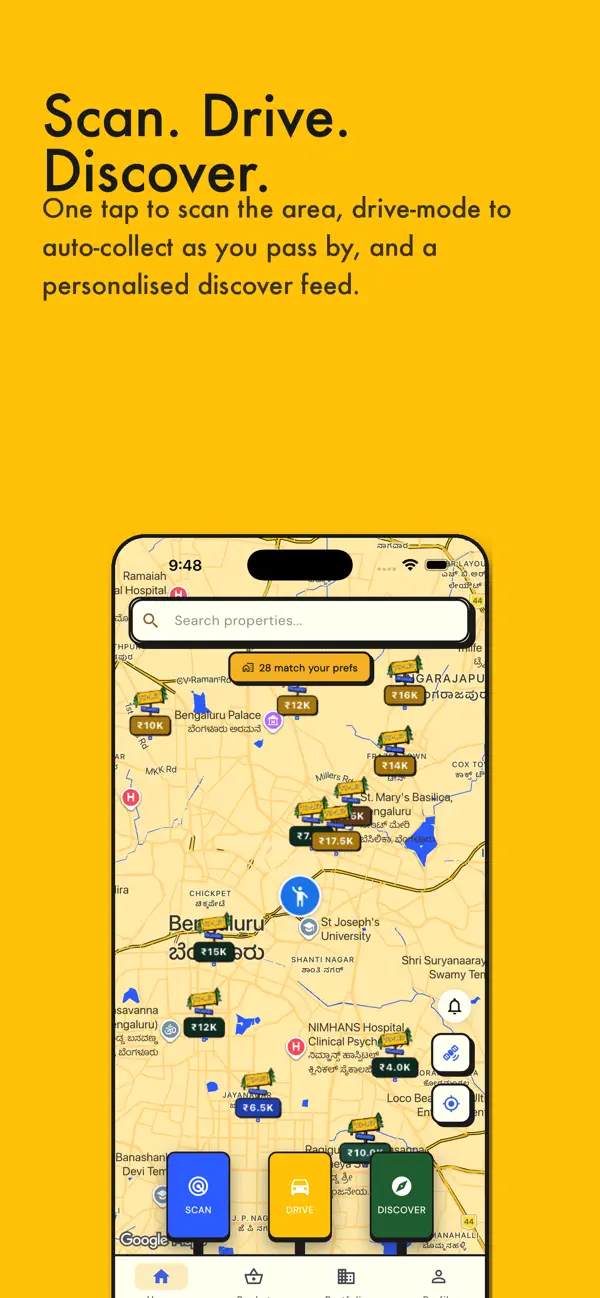
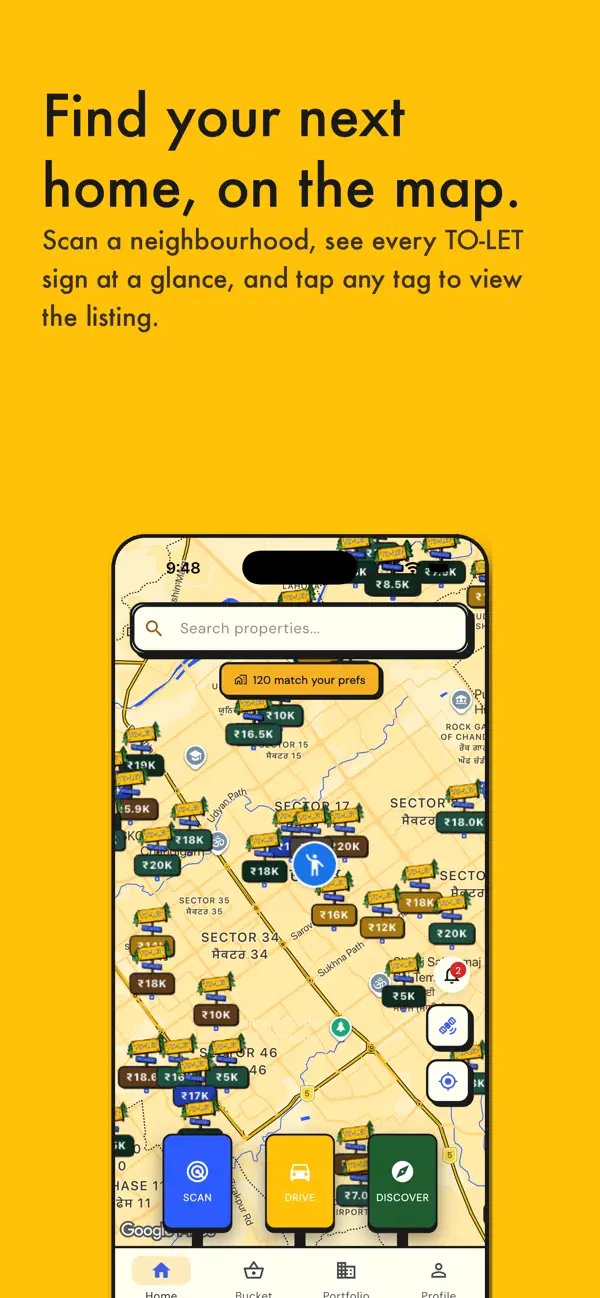
Observations
- The icon features a hand-painted wooden sign reading 'TO-LET' in bold white text on a yellow board, flanked by two cartoon pine trees on a cream background, with a blue sub-sign reading 'ZetsGeo.com'. The concept is charming and the yellow-on-cream palette is warm and distinct, but the pine trees and rustic sign motif read as a camping or outdoor-activity app at the 60x60 thumbnail size the App Store renders in search results — not a property-rental or real-estate tool. The 'ZetsGeo.com' URL sub-sign is completely illegible at thumbnail scale and adds visual noise without any brand value.
- The dominant visual metaphor (roadside rental sign in a forest) signals a rural or novelty context rather than a tech-enabled property discovery platform, which is the actual product. In a search result row alongside Zillow, Realtor, and Apartments.com — all of which use clean letterforms or house glyphs — this icon looks more like a game than a utility.
- At full resolution the illustration quality is solid and the rounded-rectangle crop is well-executed. The problem is category fit and thumbnail legibility, not craft.
Recommendations
- Retain the bold yellow brand color — it is distinctive in a category dominated by blue and red — but replace the pine-tree/sign illustration with a category-native glyph: a map pin, a house outline, or a stylized location dot. These read as 'property' instantly at 60x60.
- Remove the 'ZetsGeo.com' URL sub-sign entirely. URLs on icons are not readable at thumbnail size and signal low production quality to US users who are accustomed to polished app icons.
- Consider a letterform approach: a bold 'Z' or 'G' in white on the brand yellow, with a subtle map-pin or location-wave element integrated. This would be distinctive, brand-consistent, and instantly category-legible in search results.